


 by Harsh Saini
Imagine you're a trader analyzing the daily returns of your stock portfolio. You have a sea of numbers, but what do they mean? How do you summarize them into something meaningful? This is where descriptive statistics come in, offering a way to make sense of complex data. In this post, we'll dive deep into quantitative analysis statistical methods with a focus on descriptive analysis. We'll explore measures of central tendency (mean, median, mode), measures of dispersion (variance, standard deviation), and data visualization techniques (histograms, box plots).
Descriptive statistics provide a summary of data, making it easier to understand and interpret. They help answer questions like: What is the average value? How spread out are the values? Are there any outliers? This analysis forms the foundation for further statistical techniques, including inferential statistics. Stocksphi excels in helping traders, investors, learners, technologists, and professionals leverage these methods to solve complex problems, providing clear insights and actionable information.
Quantitative analysis involves collecting and analyzing numerical data to identify patterns, trends, and relationships. It is widely used across various industries to support decision-making processes. For instance, in finance, quantitative analysis helps in assessing investment risks and returns, while in healthcare, it aids in understanding patient demographics and treatment outcomes.
Quantitative analysis is applicable in numerous fields:
Descriptive statistics are crucial because they provide a clear and concise summary of the data, making it easier to understand large datasets. They help in identifying patterns and trends, facilitating informed decision-making. By summarizing data, they make complex information more digestible and accessible.
Descriptive statistics can be categorized into three main types:
Measures of central tendency are crucial in descriptive statistics. They give us an idea of the central value around which other data points cluster. In this section, we will explore the mean, median, and mode.
The mean, often referred to as the average, is the sum of all data points divided by the number of data points. It's a simple yet powerful way to find the central value of a dataset.
To calculate the mean, you add up all the numbers in a dataset and then divide by the number of data points.

Imagine you have the following daily returns of a stock: 2%, 3%, -1%, 4%, 5%. The mean return is calculated as:
![]()
The median is the middle value when a dataset is ordered from least to greatest. It is less affected by outliers and skewed data compared to the mean.
To find the median, you:
Using the same dataset: 2%, 3%, -1%, 4%, 5%, we first order it: -1%, 2%, 3%, 4%, 5%. The median is the middle number, 3%.
The mode is the value that appears most frequently in a dataset. There can be more than one mode or no mode if all values are unique.
To find the mode, you count the frequency of each value in the dataset and identify the one with the highest count.
For the dataset: 2%, 3%, -1%, 4%, 5%, since all values are unique, there is no mode. However, if the dataset were: 2%, 3%, 2%, 4%, 5%, the mode would be 2% because it appears most frequently.
Understanding these measures is critical for traders and investors. Stocksphi helps you apply these concepts to your trading strategies. For instance, calculating the mean return of a stock can help you understand its average performance over time. The median can provide a better sense of typical performance, especially if there are outliers. Meanwhile, knowing the mode can indicate the most common return value, which might be useful for certain trading strategies.
While measures of central tendency provide insight into the central value of a dataset, measures of dispersion tell us about the spread or variability of the data. This section covers variance and standard deviation, key metrics for understanding data dispersion.
Variance measures how far each data point in a dataset is from the mean. It provides a sense of the dataset's overall variability.
To calculate variance, you:
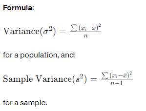
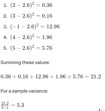
For our dataset: 2%, 3%, -1%, 4%, 5%, the mean is 2.6%. The variance calculation involves the following steps:
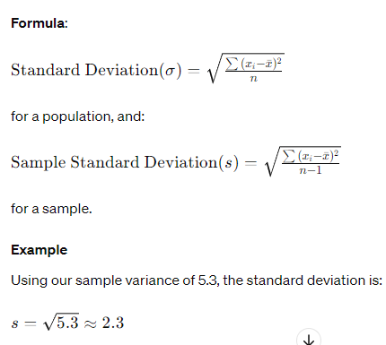
Standard deviation is the square root of the variance. It provides a measure of the average distance from the mean, making it easier to interpret since it's in the same units as the original data.
For traders and investors, understanding variance and standard deviation is crucial. Stocksphi uses these metrics to help you assess the risk associated with different investments. High variance or standard deviation indicates greater volatility, which might mean higher risk. Conversely, low values suggest more stability. By incorporating these measures, Stocksphi enables you to make informed decisions about your portfolio.
Data visualization is a powerful tool that helps traders and investors understand and interpret data quickly and efficiently. It converts complex numerical data into graphical representations, making it easier to identify patterns, trends, and outliers. In this section, we will explore two essential data visualization techniques: histograms and box plots.
A histogram is a type of bar chart that represents the distribution of numerical data. Each bar in a histogram shows the frequency of data points within a specific range or bin.
To create a histogram:
Imagine you have the following dataset of daily returns: -2%, -1%, 0%, 1%, 2%, 2%, 3%, 4%, 5%, 5%. To create a histogram:
Here’s a simple histogram of this data:
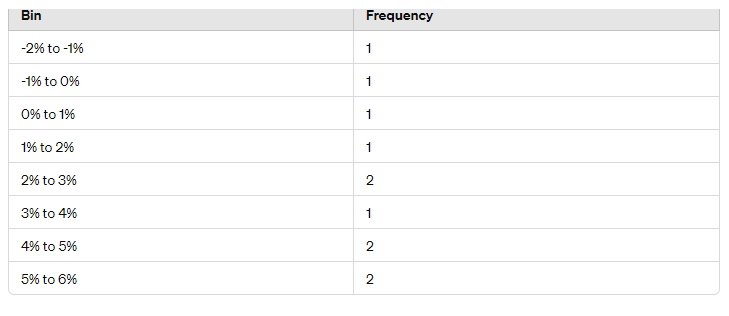
Histograms are particularly useful for showing the distribution of returns over a period. Stocksphi helps traders and investors utilize histograms to identify patterns and make data-driven decisions. For instance, a histogram can reveal whether returns are normally distributed, skewed, or have multiple peaks, informing strategies accordingly.
A box plot (or whisker plot) is another graphical representation that summarizes a dataset's central tendency, dispersion, and skewness.
To create a box plot:
Using our dataset: -2%, -1%, 0%, 1%, 2%, 2%, 3%, 4%, 5%, 5%, we calculate:
The whiskers extend to:
Box plots provide a concise summary of data distribution, highlighting central values, variability, and potential outliers. Stocksphi uses box plots to help traders and investors quickly grasp the spread and symmetry of returns, aiding in risk assessment and strategy development.
Data visualization transforms raw data into insightful visual representations. Stocksphi leverages histograms and box plots to empower traders and investors with a clearer understanding of their data. These tools make complex data accessible, facilitating better decision-making and more effective risk management.